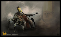

I really love the process of painting a concept design. More often than not, it's really about the journey. I'm just going to pour some thoughts out on this, about the things that I theorized and the process I took to accomplish this piece. And as always, I'm open to constructive criticism - why things work and why things don't work.
As artists, I think we see the world in terms of shapes and values. The values make up the shapes. It's about how light plays with shadows. Something that I learned from my figure drawing classes is that once you stop labeling the eye, you start to see it as an abstract shape. Basically, you start to draw what you see and not what you know. Hence, we see things in shapes and values.
Another thing about shapes is you have to find ways of breaking it up. When you find yourself having one big empty space on your design, it leaves it off balanced and empty. I did this all throughout my design, from the legs of the chair, to the plates on the chair, to the Ambassador's clothes, and such. Of course, don't over do it, do it to where it works. Otherwise, there's just a blob of color that's suppose to be the leggings of a chair, and that's boring. I guess that's part of detailing.
I started this piece in black and white. But I've noticed that a lot of great artists, don't just use real grayscale. It's either a cool gray or a warm gray. After working on it in grayscale, I used the photo filter option (image/adjustments/photo filter) and overlayed a warm tone on it and from there I started refining it again, color picking the values around the piece. Once I felt like I had somewhat of a defined design, that's when you can overlay color. Color doesn't work if values do not work!!!!!
When picking out colors, I usually try to limit myself to a couple, maybe 3 max to start out with. I'll add another color if I really need to, something to draw attention to. But that's about it, and most of the time, I'm using the eye dropper tool to select colors. I would use the color wheel very seldom.
Repetitive design is also a good thing as it makes a piece a whole. I.e. the legs, and the logo branded on to the plates. This helps a lot with environment work as well. If you've noticed, a lot of people would repeat a similar shape of something as it goes back towards the horizon.
A few more other things: The transform/warp/distort tools are your friends as well as layer masks. Flipping your work as you move along is essential. Limit your brushes, too. I usually only use the round brush with different presets to it. Custom brushes are great for texturing, but most of the time I'm only using a few varieties of the round brush. I try to limit myself when it comes to zooming into a piece. I paint with the canvas zoomed out about 33% or whatever fits to screen. And use big brushes.
I think that pretty much sums up what I think about when I'm painting. I know a lot of these are things we all already know, but it's nice to put things to words.
Cheers,
Angelo
2 comments:
HI Angelo, I think this is you most complete and best painting so far.Although the fat guy could use some more work I feel a pleasant design going on and the rendering fits the style. Thank you for explaining the process.
Talk to you soon hopefully
Angelo,
This was a very complete summary of terrific guidelines for concept art, or illustration in general. Thanks for the detailed post!
Post a Comment